MaltaType tells us about the influences behind our shop front signs, how to distinguish the old ones, and how they richly contribute to our visual identity.
Beginning in the seemingly historic years of pre-Instagram, Ed Dingli, Katerina Karamallaki and Matthew Demarco, three designers and typography-appreciaters, set up Maltatype, with the aim of creating a digital archive of Malta’s most beautiful shop signs. The platform then moved on to Instagram, and is now followed by thousands from all corners of the world.
“Many people have told us that before we started our blog, they never knew that such signs existed, but once they began looking at our page, they started seeing them everywhere,” the team behind Maltatype reveals. In fact, to garner appreciation is one of the main reasons behind this ongoing collection, built on gems found not only by the team, but by anyone who comes across one.
Influences behind the type
As technology and foreign influence on the island changed, so did the typography of Malta’s shop front signs. “A lot of the signage was done when we had influence coming in from Italian gazzettes, newspapers and adverts,” said MaltaType. “When there were things being aimed at the British, the typography then had a lot of British influence too; such as from lettering found on packaging and beer bottles.”
Then, along came the Internet, providing design, and absolutely everything else, with a limitless window of possible influences. “With the use of the Internet came people having such a wide range of typography that they were getting influences from absolutely everywhere,” they say.
Distinguishing features of an old shop front sign
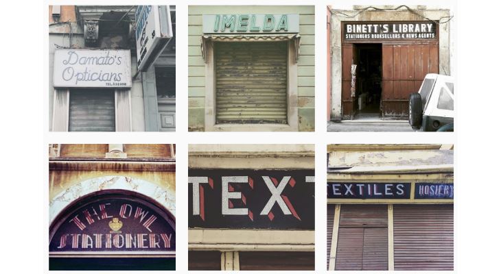
Although not restricting themselves to only documenting old shop signs, the greater majority of shop front signs that form part of the collection are pre-Internet, with some going back about 100 years. Many of the oldest shop front signs have distinguishing features which set them apart from others.
They are made out of wood and have a frame which is built at an angle for rain to drop off them. The glass is painted from the back so that the front is protected, and have foil, gold leaf, guilding or broken glass behind, embellishing the lettering.
Part of Malta’s visual identity
“We think that they form a very interesting part of the architecture of a street and the city, town or village that goes along with it... it is part of our visual landscape and visual identity” they say. “They should be looked at and preserved in the same way that architectural features would be preserved, as they give a certain character to a place, which can be added on to, but once it is taken away, you are automatically changing that character.”
“Change is not necessarily bad,” they continue, “but when you have a very interesting quirk to a place, you want to preserve that because that is what the place has going for it. It makes more sense to develop on top of something rather than scrap what there is. It is not about nostalgia, it is about building and creating, but in a way that is honest and genuine to the place.”
Where to find them
There are many hidden treasures sprinkled over Malta’s streets, and part of the fun is coming across one when you least expect it. But where can one go to definitely find some?
“They are mostly in older towns, and probably the largest abundance is in Valletta,” they advise typography-hunters. “Hamrun is also home to many, though some have recently been destroyed. Sliema and Floriana are also places with a lot of old signs... basically places where there was a lot of commerce happening.”
That being said, keep your eyes peeled as you're walking around anywhere, sometimes you come across a treasure when you least expect it!