


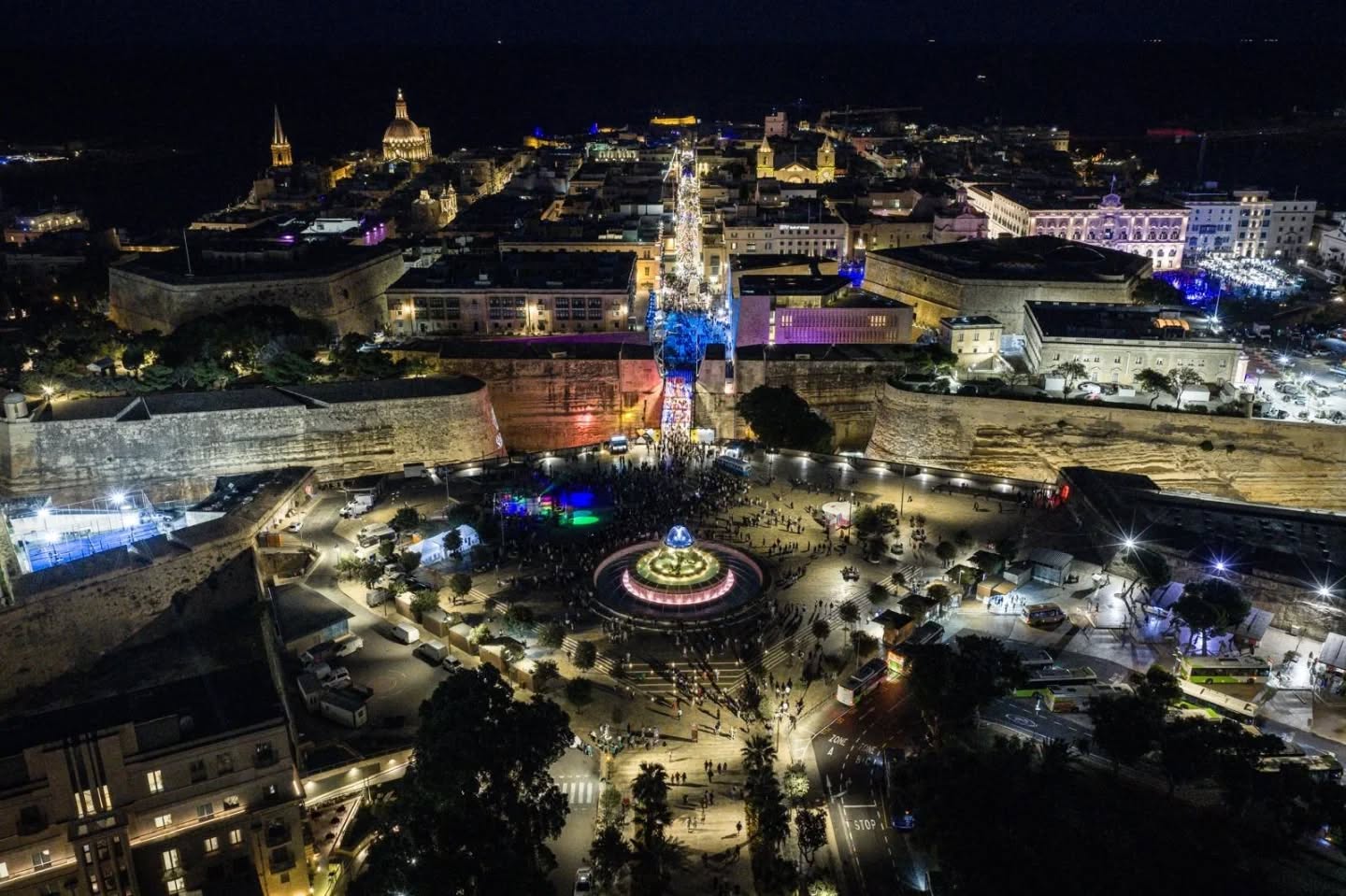
Heading to Notte Bianca? Special night bus services announced
Notte Bianca returning to Valletta tomorrow!




MaltaType tells us about the influences behind our shop front signs, how to distinguish the old ones, and how they richly contribute to our visual identity.


Beginning in the seemingly historic years of pre-Instagram, Ed Dingli, Katerina Karamallaki and Matthew Demarco, three designers and typography-appreciaters, set up Maltatype, with the aim of creating a digital archive of Malta’s most beautiful shop signs. The platform then moved on to Instagram, and is now followed by thousands from all corners of the world.
“Many people have told us that before we started our blog, they never knew that such signs existed, but once they began looking at our page, they started seeing them everywhere,” the team behind Maltatype reveals. In fact, to garner appreciation is one of the main reasons behind this ongoing collection, built on gems found not only by the team, but by anyone who comes across one.
As technology and foreign influence on the island changed, so did the typography of Malta’s shop front signs. “A lot of the signage was done when we had influence coming in from Italian gazzettes, newspapers and adverts,” said MaltaType. “When there were things being aimed at the British, the typography then had a lot of British influence too; such as from lettering found on packaging and beer bottles.”
Notte Bianca returning to Valletta tomorrow!
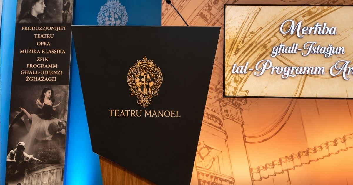
Events range from opera and classical music to theatre, musicals, dance and performances for youn...

The LEGO expo is returning for its fourth edition
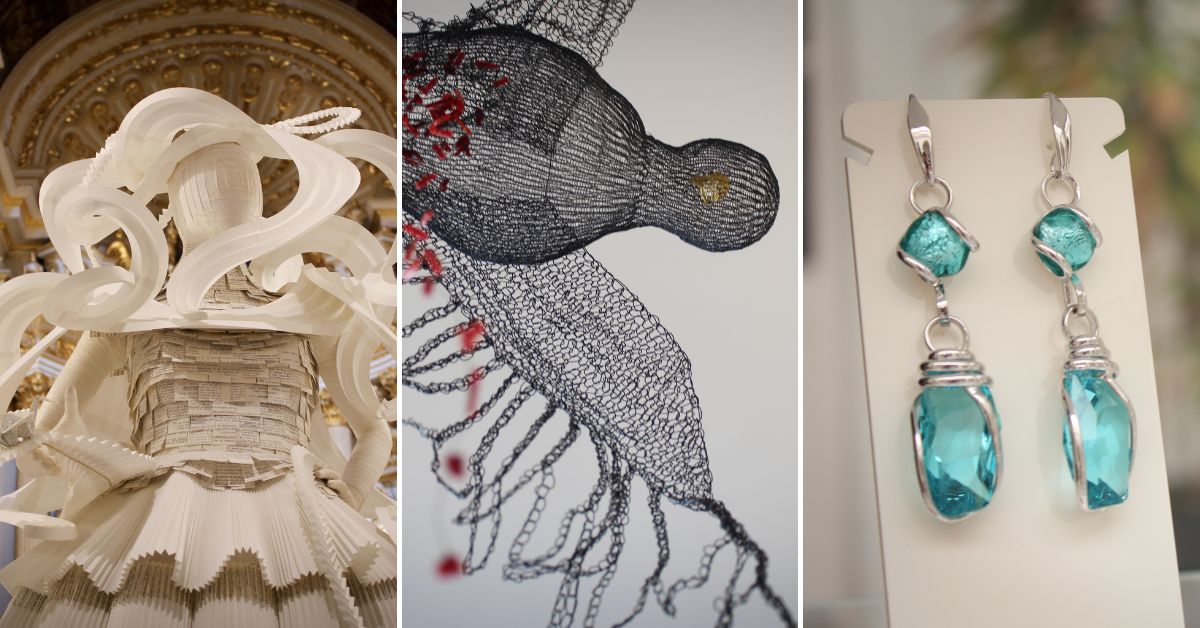
designMT is promising its most international showcase yet!